HTML <picture> element
The <picture> element gives the browser several possible image sources and lets it choose the most suitable one. It is a container for responsive image selection.
Inside <picture>, zero or more <source> elements describe alternative image resources. A final <img> element provides the actual image element, fallback source, dimensions, and alternative text.
This is useful when the image itself should change under different conditions. A narrow screen might need a cropped image. A wide screen might need the full composition. A modern browser might use WebP or AVIF, while another browser uses JPEG or PNG.
The <picture> element is different from using only srcset on <img>. Plain srcset is usually enough when the same image is offered at different sizes or resolutions. <picture> allows different sources based on media conditions or file type support.
The <picture> element does not replace <img>. It depends on it. The <img> inside is still the embedded image, and its alt text must describe the image in a way that works for the possible selected sources.
Source order matters. The browser uses the first suitable <source> whose conditions match, then selects a candidate from its srcset. If none matches, it uses the <img> source choices. This fallback is for source selection; it is not a guarantee that a failed image download will try the next source.
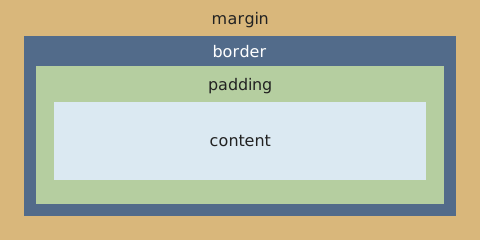
The example selects a wide box-model diagram at viewport widths of 700 CSS pixels or more and a compact diagram below that. The condition refers to the viewport, not the image column; in the in-app reference panel, that is the iframe's viewport. Resizing can change which source is selected.
Attributes: GLOBALS.
Typical layout:
<picture>
  <source media="(min-width: 700px)"
    srcset="examples/box-model-wide.svg"
    width="480" height="240">
  <img src="examples/box-model-compact.svg"
    alt="CSS box model, from outside in: margin, border, padding, content."
    width="240" height="240">
</picture>
Visual representation: